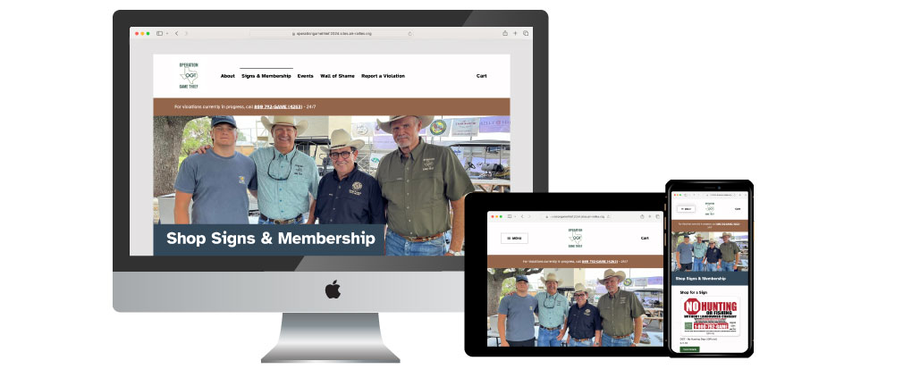
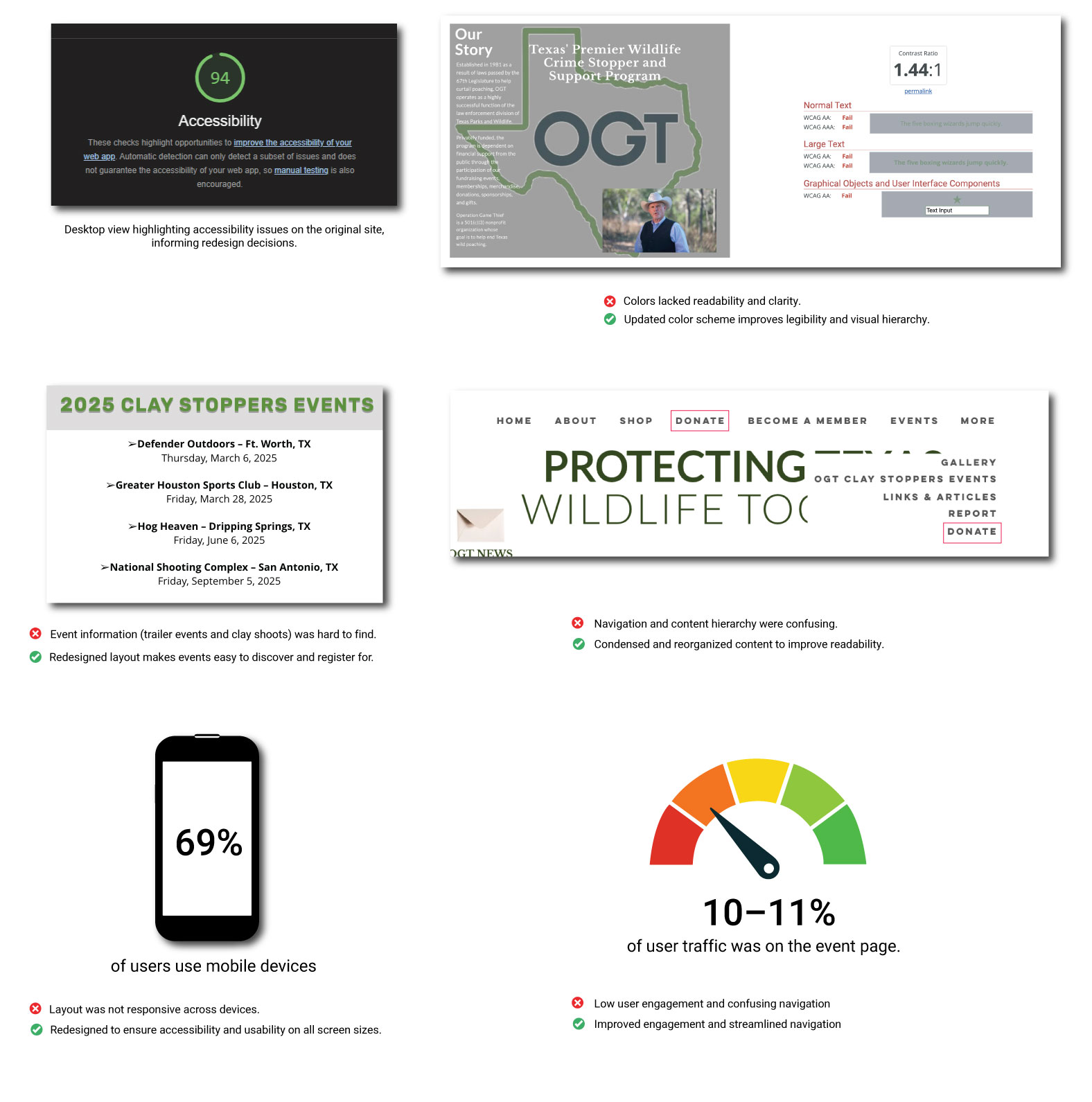
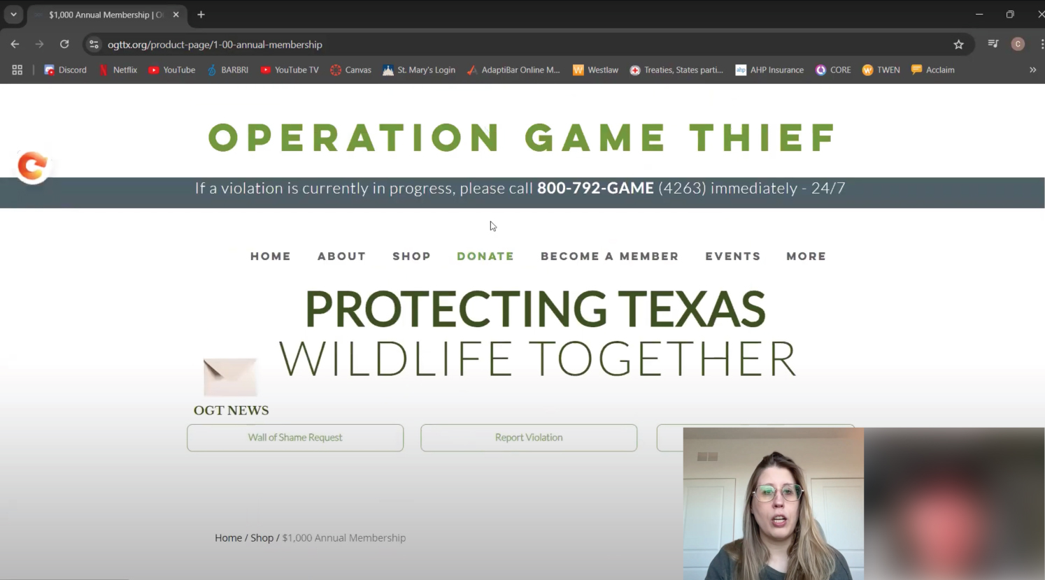
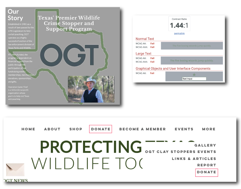
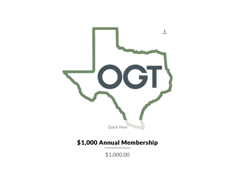
)">


X
  1. Overview
  2. The Process
  3. Problem
  4. Discover
  5. Design, Ideate, & Validate
  6. Conclusion

Operation Game Thief Website Redesign: Improving Accessibility and User Experience


My Responsibilities

    • Lead User Researcher 
    • User Experience Designer 
    • User Interface Designer 
    • Development  
Timeline & Team

  • 4 weeks timeline
  • UX Designers (collaborated with 3-4 team members)
  • 2-3 Engineers  
  • Product Owner  


Business Goal

  • Improve accessibility and mobile experience.
  • Streamline ecommerce and sign purchase process.
  • Enhance reporting process for safe poaching notifications.
Tools

  • Figma
  • Mural 
  • Google Docs 
  • Trello 
  • Zoom 
  • Illustrator
  • Wordpress

Platform

    Website : View Site


    Client

      Crystie Lynn Shibley – Project Manager, oversees website operations and approvals at Operation Game Thief


Problem

How can we improve support for wildlife crime stoppers and stop poaching?

Operation Game Thief is a wildlife crime stoppers program that offers rewards of up to $1,000 for information leading to the conviction of individuals who commit natural resource crimes. Privately funded, the program relies on financial support from the public through memberships, donations, sponsorships, and gifts. Their mission is to stop illegal poaching of wildlife.


  • How might we improve accessibility for all users?

  • How might we simplify the content to enhance user understanding and engagement?

  • How might we ensure a safe and clear process for reporting poaching?

  • How might we optimize the ecommerce and membership experience to drive engagement and support?

Solution

Improving site accessibility and navigation to help users take action against poaching.

Operation Game Thief wanted a safer, clearer, and more engaging experience for users. We enhanced accessibility with alt text, improved color contrast, and clearer typography. Content and navigation were simplified so users could quickly find key information, and membership and donation flows were optimized for a seamless experience on both desktop and mobile. These changes made it easier for users to take action and support the program.


The Approach

Collaborating with Crystie: Planning the Redesign of Operation Game Thief


The plan allowed us to do the following:

  • Making sure we kept the project within our timeframe of AIR

  • Holding each team member accountable

  • Organize and divide the work among the team members.  

  • Making sure that we keep in track with our client and the judgement form

Date/Week Event/Task Category
Sep 26 Kick-Off! Kick-Off
Sep 30 - Oct 6 WordPress Accessibility Training Training
Oct 2 Decide platform/template and sitemap Planning
Oct 14 - Oct 20 Finalize colors/templates with Crystie Design
Oct 24 Judges Happy Hour/Q&A Checkpoint
Oct 25 Midway Rally Checkpoint Checkpoint
Nov 26 Site Submission Form Due Submission
Dec 23 Judging Results Results
Jan 16 Awards Ceremony Awards


Research

Understanding Website Performance

We began by analyzing how users interact with Operation Game Thief’s website and assessing its accessibility using Lighthouse audits. Key questions guided our research: How are users engaging? What’s mobile vs. desktop usage? Which pages matter most? Why do users drop off?


Insight


User Testing & User Interviews

Understanding Poaching & OGT Customers

To gain a deeper understanding of these insights, we conducted 5 moderated user tests and interviews. Participants performed tasks like finding an event, purchasing a sign, and reporting poaching, while sharing their overall impressions. We also followed up with questions to understand their reasoning and expectations around rewards for reporting poaching.


Insight


<


Pivot 1: Collaborating the Client and Design Team

Receiving Feedback from the Crystie and Team

TTo make sure our solutions aligned with the client’s vision, we set up weekly calls with the client and collaborated closely in Slack and Figma. This allowed us to share feedback quickly and keep the project moving. Overall, the client was receptive to our ideas and helped us focus on refining the most important features.


Click on the image to Zoom in

The Company’s Vision & Challenge

Keeping on Track

  • How might we improve accessibility for all users?
  • How might we simplify the content to enhance user understanding and engagement?

  • How might we ensure a safe and clear process for reporting poaching?

  • How might we optimize the ecommerce and membership experience to drive engagement and support?


Improving Design and Accessibility

Sketching Solutions for E-commerce Signs, Membership, and Accessibility

After leading the user research, I shifted into supporting the design team with a focus on the e-commerce page. My role included creating wireframes, simplifying navigation, and ensuring the design met accessibility standards. We used card sorting to organize content and a mood board to define the visual direction.


Design Not Optimized for All Devices (My Contribution)


Text & Color Contrast was difficutlt to Read (Team and My Contributions)


Development

Bringing the Design to Life

Once wireframes were approved by Crysite, we built the site in WordPress, focusing on accessibility, responsiveness, usability and performance. We ran Lighthouse audits before and after, used an accessibility checklist, and tracked fixes in Trello.


Outcome & Lessons

Our team placed 5th in the design competition, but the project continued toward production.


    • Accessibility improves everything. Implementing WCAG/ADA compliance benefited all users. The platform became easier to use and more inclusive for everyone, not just those with accessibility needs.

    • Safety is rewards. Users valued trust and secure reporting more than incentives. Prioritizing safety helped improve user confidence and engagement.

    • Platform choice matters. Switching platforms unlocked the functionality the client needed. This allowed the team to meet user expectations and implement features that were previously unavailable.

    • Limited testing informed decisions. While we only tested with one participant due to time constraints, the feedback still provided valuable insights that guided small design adjustments.


    Next Steps
    • Finalize core ecommerce and donation workflows including payment processing, shopping cart screens, and donation flows, to ensure a seamless user experience.

    • Set up production environment configure hosting, tie accounts to the client billing, initialize the site, install plugins, and set up a child theme.

    • Test and verify functionality check all links, forms, payments, responsiveness, and content accuracy.

    • Client training and handoff provide Crystie with documentation, conduct walkthroughs, and gather final approval before launch.

    • Launch site update DNS to point the OGT URL to the new WordPress site and verify everything is live and functional.

    • Continue testing and iterating on features based on real user behavior to improve usability and engagement.


View More Work