Solution
Quickly view recurring subscriptions via bank account or manually, cancel unwanted subscriptions & receive alerts.
Membership tracker is a subscription management mobile application where consumers can manage their spending. It allows consumers to view their recurring subscriptions by connecting to their bank accounts and/or manually. In addition, consumers can cancel any unwanted subscriptions and get notified in advance.
The Approach
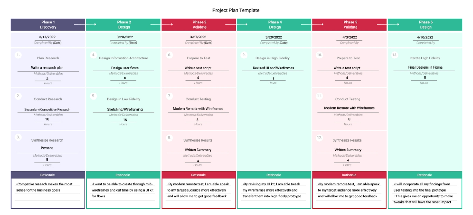
The membership tracker, was completed in 6 weeks by coming up with a plan. By having a plan in advance, I could complete the task in a reasonable amount of time.
Market Research
What are the strengths and weaknesses of subscription management services?
To begin, I analyzed 3 key markets that manage subscriptions: Trim, Truebill, and TrackmySubs, to understand the usability of each competitor and the strengths and weaknesses per feature. Can the consumer see all subscriptions? Are subscriptions easily canceled?
By keeping the UX heuristic principles in mind, I was able to conduct a SWOT.
 |
 |

|
|
|---|---|---|---|
| About |
|
|
|
| Strengths |
|
|
|
| Weaknesses |
|
|
|
| Opportunities |
|
|
|
| Threats |
|
|
|
Insights
- Clarity & Easy to Use: Alerts were difficult to find and navigate too.
- Control: There was no control over setting your account manually or with your bank account.
- Discoverability: The ability for the user to find the information that they are looking for like manually and alerts.
- User Feedback: The application tells the user each step of the process.
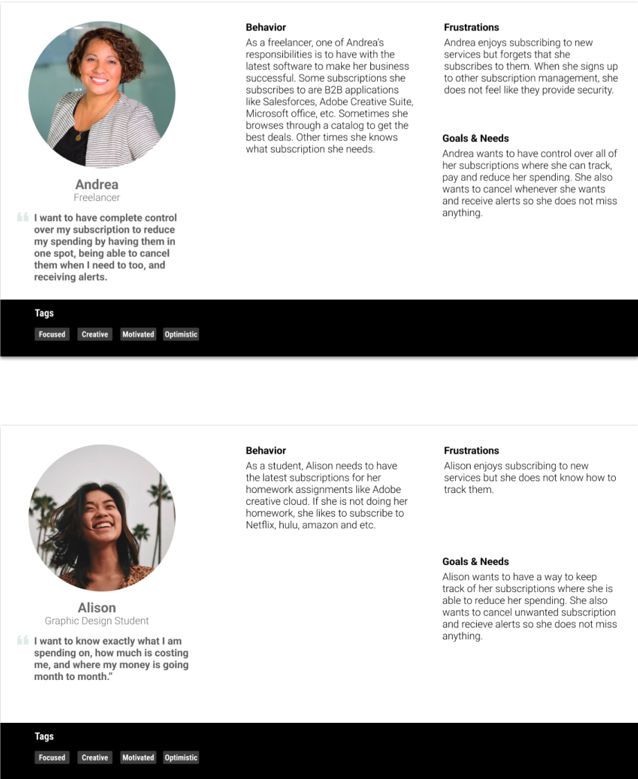
User Persona
Who are my potential customers?
There were two potential customers that were identified that would be using my product to keep track of their finances. The first would be Andrea, a freelancer who has a small business. She wants to have complete control over her finances to save money. The second would be Alison, a graphic design student, who signs up for subscriptions, but she doesn't know how to track them. Both customers are disorganized and need alerts so they can cancel unwanted subscriptions.
The Challenge...
-
How might we help Alison and Andrea keep track of their subscriptions to increase the conversion rate?
- How might we enable Alison and Andrea to cancel unwanted subscriptions?
-
How might we help Alison and Andrea receive auto-renew alerts in advanced?
User Flow
Mapping out Andrea and Alison’s journey
Andrea and Alison's journey would track their subscriptions in place either by manually entering them or connecting to their bank account, canceling unwanted subscriptions, and having the ability to set up notifications. It was important for me to map and see each step of their journey to know which areas decreased any confusion and had my overall product low risk.
Wireframe
Building the Flow
I started building the product by creating wireframes in a monochromic visual to get ready for user testing. During the process, I labeled each red route and connected all the wireframes to ensure that I had all the key features and insights I gathered in my research. For example, I had to ensure that Alison and Andrea understood their financial situation and had complete control over their subscriptions.
Usability Testing
What are the users thinking?
Next, I recruited 5 candidates with subscriptions looking for a way to keep them on track for usability testing. I conducted the testing 3 in-person and 2 through zoom, where I observed and moderated the participant's behavior and gained feedback. The goal was to see what experiences worked and which ones needed improvement.
Task
- Set up an account where you do not miss any subscriptions.
- Set up an account with more flexibility on what subscriptions you would like to add
- A charge came up where you don't recognize it, and now you need to cancel the subscription.
- You want to ensure that you don't miss any payments and want push notifications on a subscription.
Insight
- I observed a mixture of behaviors as a result. The first two tasks were confusing for the majority of participants. They could either complete one of the two tasks but not both.
- Two out of five participants had difficulties with unsubscribing to a subscription. Since not everything was interactive, they would click through the subscription icon or search through the application for a long time.
- As for the alert, there was a mixture of behaviors, some participants clicked through the subscription icon, or went into notification to complete the task.
- This led me to believe that my design needed improvements or I needed to communicate it better. With these findings in each route, I further iterated on the high-fidelity design.
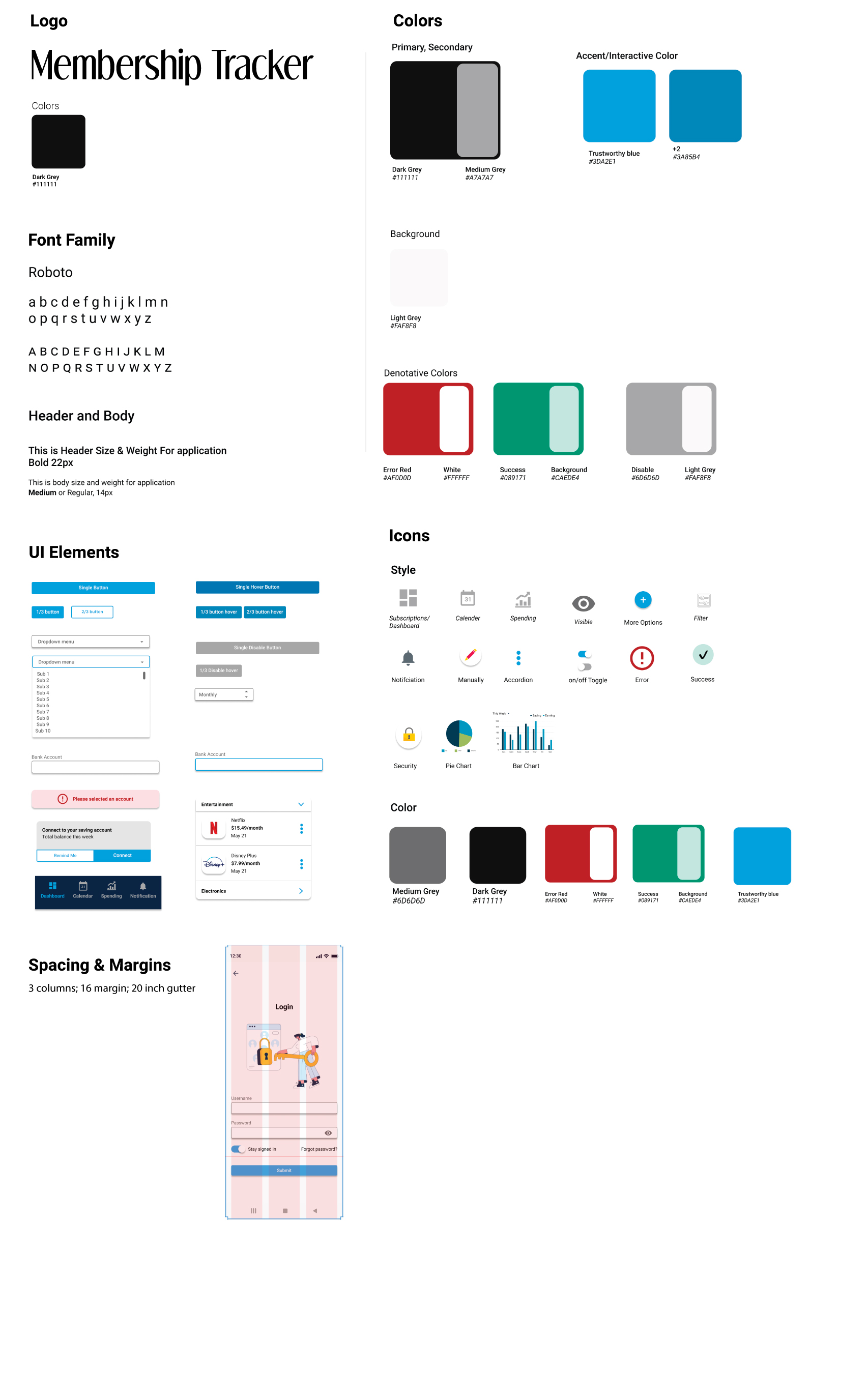
The Brand
The Feel and Look of Membership Tracker
The personality is to trust a friend helping you save money, and the attributes are trustworthy, caring, friendly, and casual. These ideas helped me create the right combination of colors like blue or purple, UI style, and typeface for the product.
The Prototype
Applying the Style Guide to the Wireframes
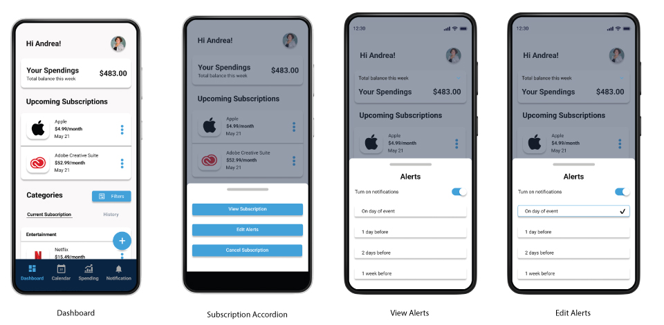
Once I had completed the style guide, I applied it to wireframes to make feel more realistic using Figma. Then, based on my usability testing findings, I made the necessary changes while creating a layout for the UI elements that made the product concise and clean possible for another round of usability testing.
Connect to your credit card, banking, and savings.
Andrea and Alison can track their recurring spending by connecting to their bank account. They can follow all of their subscriptions without missing any.
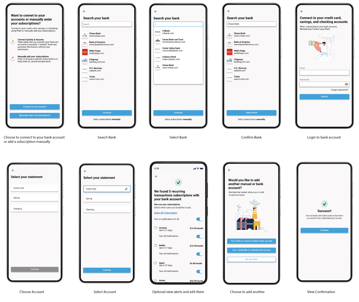
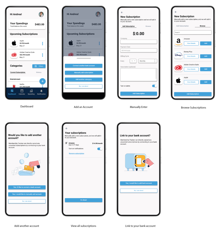
Add Account Manually
After Andrea and Alison connect to their bank account, they can also enter manually recurring subscriptions. This allows them to track subscriptions that they just signed up for or other spending like giving allowances out.
Unsubscribe a subscription
If any surprise charges show up, Andrea and Alison are allowed to cancel them. They can delete the recurring subscriptions, and Member Tracker takes care of the rest.
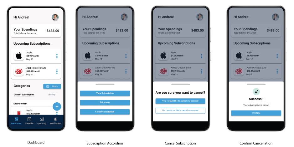
Set up Alerts
To not miss any subscriptions, Andrea and Alison set up alerts. This way, they will know when they are being charged.
The Validation
Any improvements from the 1st round?
Any improvements from the 1st round?
I conducted another round 3 in-person and 2 modern remote interviews and asked them to perform simple tasks for feedback. The goal was to see if their user experience improved from the first round. Also, I wanted to hear their feedback to see if the design conveys the product's overall personality and attributes.
Revised Task
- Create and connect a credit card automatic where it automatic full the credit card subscriptions
- After connecting your credit card, you have a recurring subscription to your bank account. You would like to add that subscription that you are aware of manually.
- A charge came up where you don't recognize it, and now you need to cancel the subscription.
- You want to ensure that you don't miss any payments and want push notifications on a subscription.
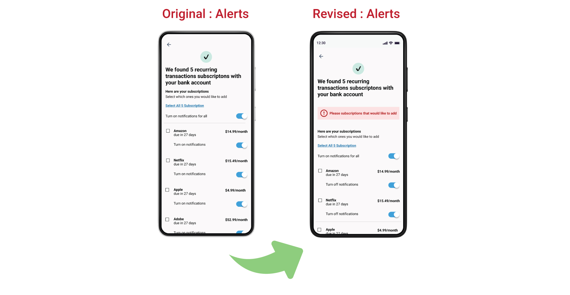
Usability Issue #1 : Error Prevention | Notifications
Problem:
- Participants would move on to the next steps of the flow even if they did not select anything.
Solution:
- When selecting subscriptions and nothing has been chosen, add an error statement.
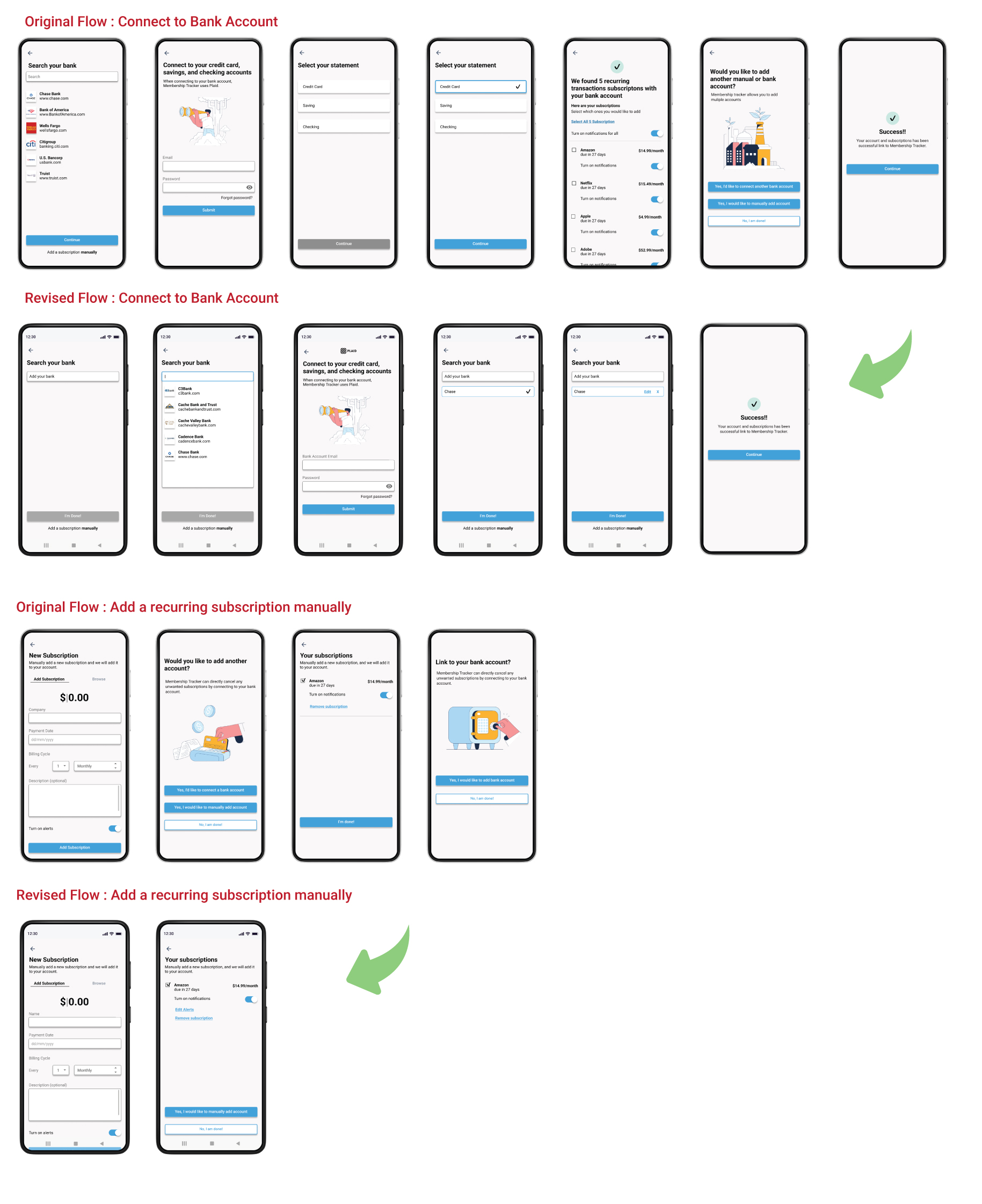
Usability Issue #2 : Recognition rather than recall | Bank Account & Manually Subscription Sign Up
Problem:
- Too many steps in the overall process when connect to users bank account
- When entering a manually subscriptions, repeated steps are happening.
Solution:
- Minimize the number of steps or combine them into one single cohesive step.
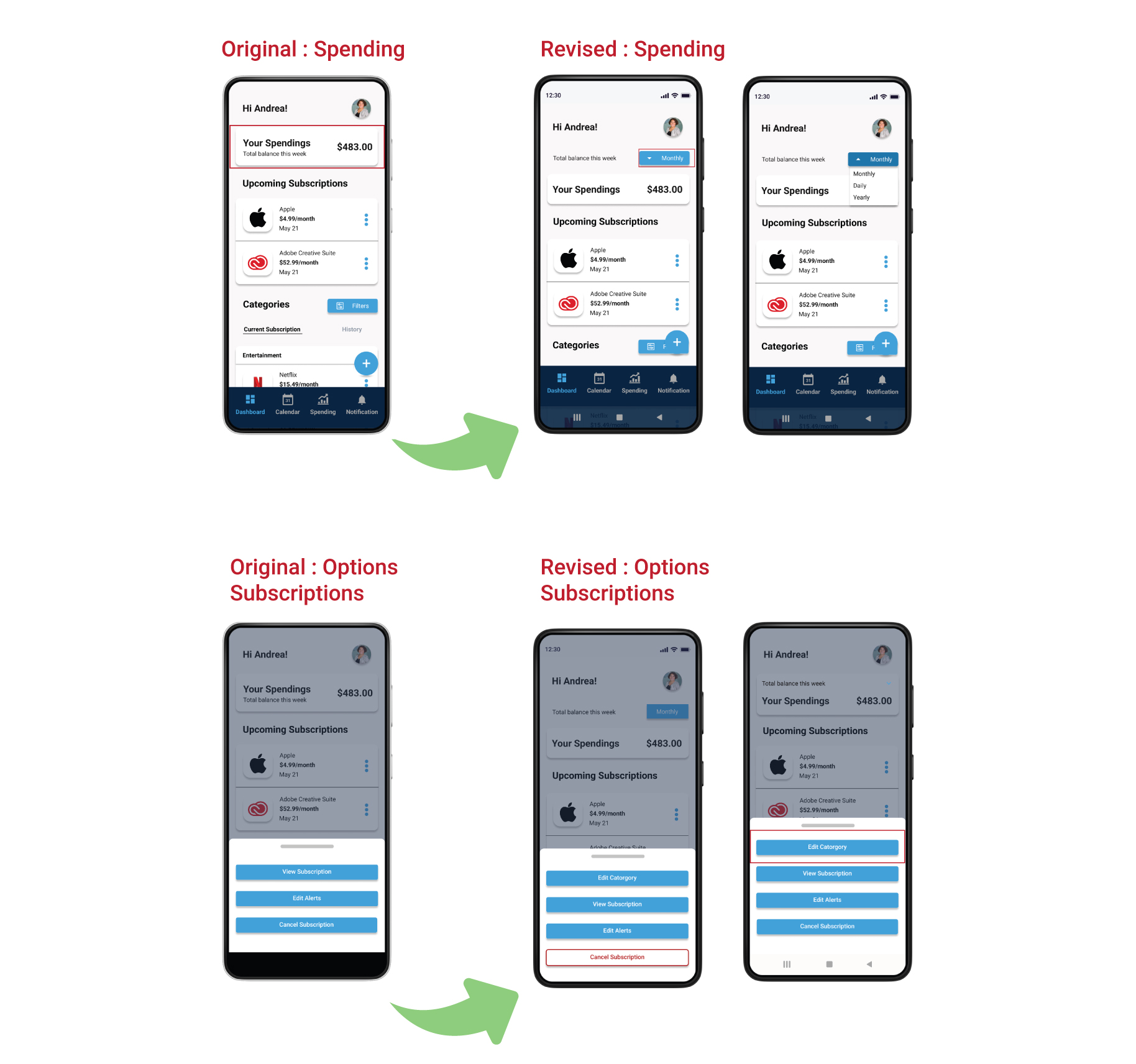
Usability Issue #3 : Control | Spending & Categories
Problem:
-
The dashboard shows the users spending per week
-
Changing a subscription category
Solution:
-
Add a drop-down menu where users can choose if they would like to view their spending, weekly, yearly, or monthly
-
Add a button where users can edit their subscriptions into new categories or existing ones.
Testing Results
Let's compare the testing from rounds 1 & 2
Task
User Testing Round 1
User Testing Round 2
Connect to your bank account to see subscriptions on credit card
60%
60%
Add a recurring subscription manually
60%
100%
Unsubscribe or cancel a subscription
60%
100%
Edit alerts
60%
100%
Overall Satisfaction
80%
100%
| Task | User Testing Round 1 | User Testing Round 2 |
|---|---|---|
| Connect to your bank account to see subscriptions on credit card | 60% | 60% |
| Add a recurring subscription manually | 60% | 100% |
| Unsubscribe or cancel a subscription | 60% | 100% |
| Edit alerts | 60% | 100% |
| Overall Satisfaction | 80% | 100% |
Interactive Prototype
Outcome & Lessons
- User experience reached business goals. Participants were able view their overall spendings, keep track of their subscriptions, add manually recurring subscriptions, cancel unwanted subscriptions, and edit alerts.
- Tasks were completed faster the 2nd time of usability testing As I observed the majority of the tasks given, participants could complete them faster than in the 1st rounds. The color's effectiveness helped them complete the tasks with minimum difficulty and confusion.
- The usability session was more clear in the second round. I observed that the participants did not understand the task in the first round. However, participants could complete the tasks smoothly when I communicated the lessons differently.
Feature Improvements and Next Steps
- Speak with engineers to develop the prototype as a native one or at least have Axure to it to make it more interactive.
- Continue usability testing. I would like to recruit more usability so I could continue rapid prototyping and iterate.
- Add new updated and inclusive features I would like to continue to add new updated features like Premium to my product since I see it used commonly throughout subscriptions. Also, I would like to add a voice feature to the search bar and maybe add some gamification features to improve engagement.
View More Work
Webiste
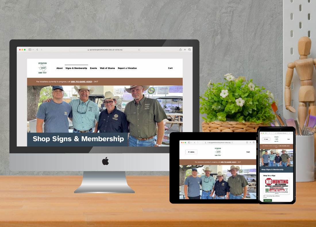
Operation Game Thief Website Redesign: Improving Accessibility and User Experience
Redesigned a nonprofit website to improve accessibility, simplify content, and optimize donation and reporting flows. Fully responsive and WCAG/ADA-compliant.
Client: Operation Game Thief
See Case Study