Problem
How can people release their stress, anxiety and sleep in a healthy way, and why are consumers abdonding their shopping cart?
Crowddoing is a nonprofit organization helping medicinal foods develop a website to educate consumers about how alternative medicine can relieve anxiety, stress, and sleep. Not only are they educating consumers but also providing them with a subscription box that contains detox teas and health-beneficial foods. Overall, their goal is for consumers to not abandon their carts before purchasing products online and learn more about medicinal foods.
How might educated consumers about medicine and foods and eventually get them excited about purchasing a box?
How might we get the customer to complete a purchase without abandoning their shopping cart?
How might educated consumers about medicine and foods and eventually get them excited about purchasing a box?
How might we get the customer to complete a purchase without abandoning their shopping cart?
Solution
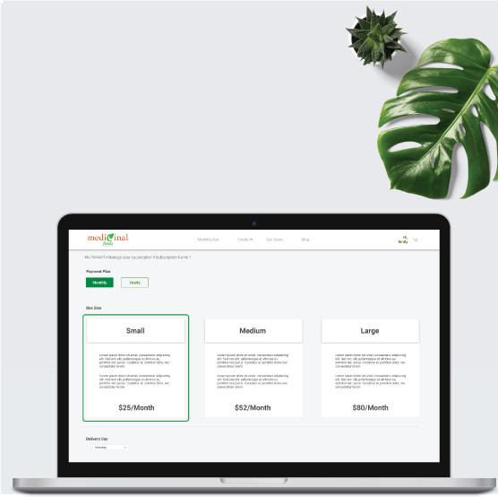
Educating consumers on medicinal foods and providing them with an e-commerce site that is easy to use with a few steps, an option to log in as a guest, and the ability to change their subscription.
Medicinal foods provide a website where they want the user experience team to understand the market, gain insights about their target audience's goals, pain points, and needs, prototype, and test to ensure it meets their needs. In addition, medicinal foods wish for e-commerce that is easy to use with a few steps and an option to log in as a guest and change the subscription at any time.
The Approach
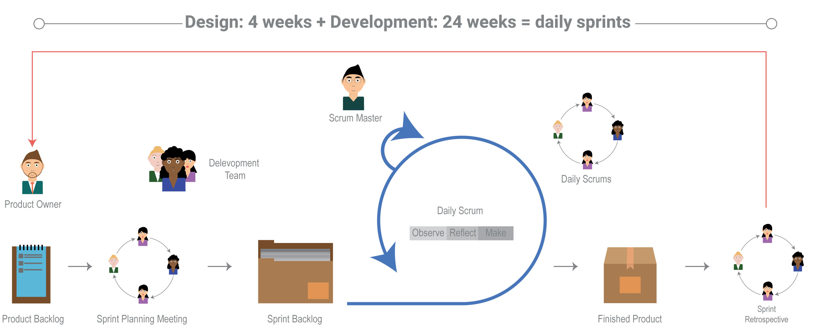
Solving problems with the scrum agile design framework
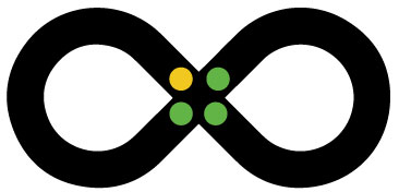
It's referred to as the "the loop," which was developed by IBM. A continuous cycle of:
-
Observe: understanding the situation that the user is facing
-
Reflect: focus on a specific point of view and come up with a plan
-
Make: transform your ideas into low prototypes for testing your hypotheses quickly and cheaply
Research
Understanding Medicinal Foods, the Market and Cart Abondement
It began when the UX team and I wanted to learn more about medicinal foods and the market. I discovered the majority of the data was to understand our target audience, and the market but not how to prevent online shop-cart abandonment. So, I conducted my own quantitative and qualitative research by reading blogs and articles to understand why consumers abandoned their e-commerce shopping carts during checkout before making the sale.
The goal was to help me validate my design decisions while designing the e-commerce page.
Insight
Our competitors don’t go into depth when it comes to educating consumers on the benefits of alternative medicine.
Consumers don’t take any natural foods on a daily based for their stress, anxiety, and sleep disorder.
Shoppers are annoyed with too many steps.
Many websites ask shoppers for you to make an account before purchasing the items
Shoppers dislike surprises at the end of their experience, like not seeing the shipping cost from the start
The majority of shoppers are on economic browsers to "just browse."

Personas
Who are our potential customers?
With the insights that were gathered from our research, we collaborate and discuss 3 potential users in a workshop who would be using our product. They all shared the goal that they wanted a healthy lifestyle and to learn about alternative medicine. However, our primary focus was on James, who is suffering stress from and anxiety through our research. We learned that he is having a hard time prioritizing his mental health. Overall, this allows me to have a better empathize with users throughout the process and discover their pain points and goals.
MariaHealth and Wellness Seeker |
SerenaLifestyle and Health Social Media Influencer |
JamesStress & Anxiety Sufferer |
Goals
|
Goals
|
Goals
|
Pain Points
|
Pain Points
|
Pain Points
|
The Company’s Vision & Challenge
To stay on track with the Crowding vision, I wrote some key problem statements.- How might we educate Maria, Sarah, and James about medicine and foods and eventually get them excited about purchasing a box?
- How might we get Maria, Sarah, and James to complete a purchase without abandoning their shopping cart?
Main User Flow
Mapping out the Journey
A detailed task diagram was created to focus on finding, changing, and then checking out their subscription box order. Our goal was to create a flow chart to help us understand the specific steps that the consumer would take when ordering their box. By doing this, I determined how long it would take to complete each task.


The Design
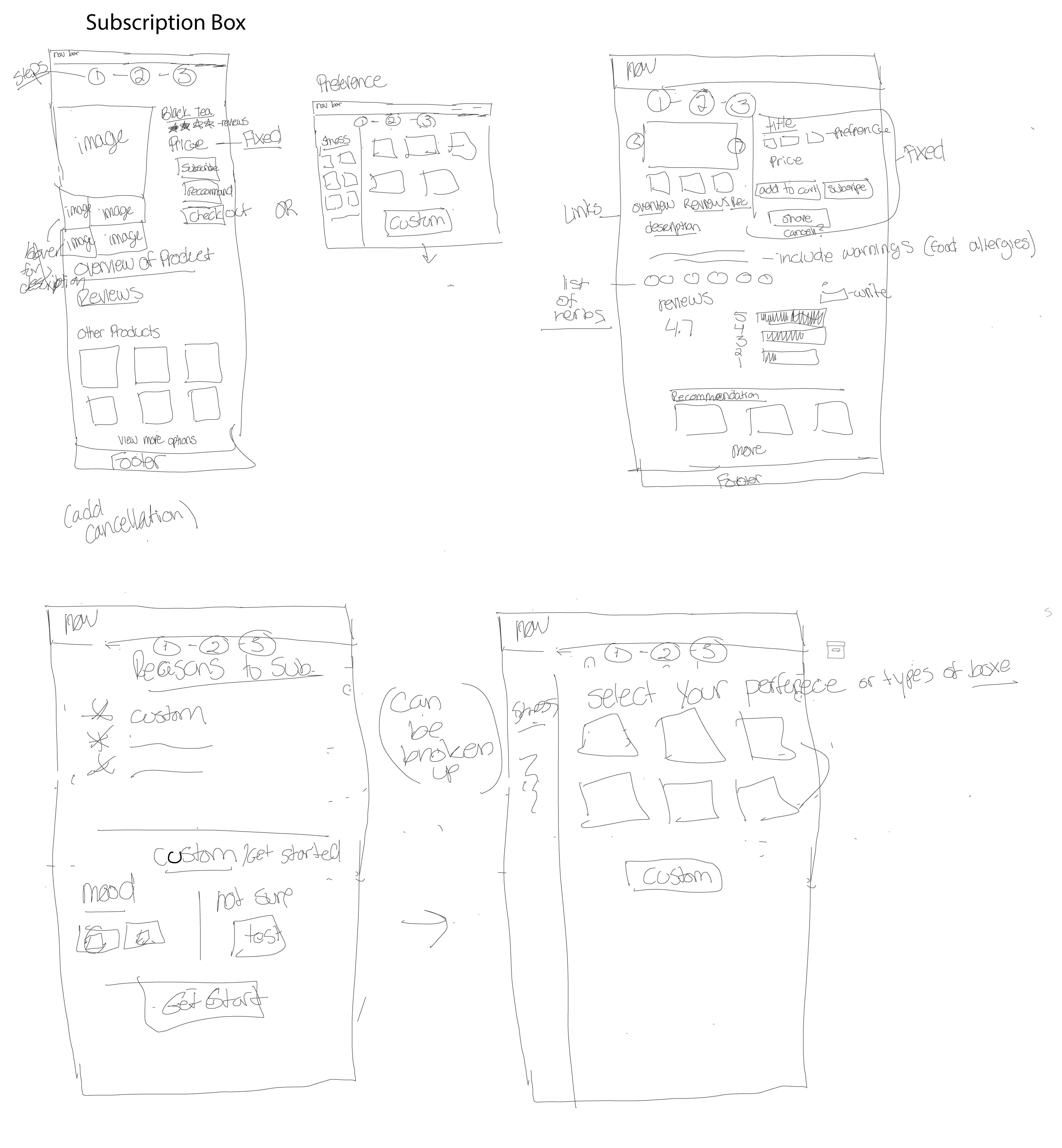
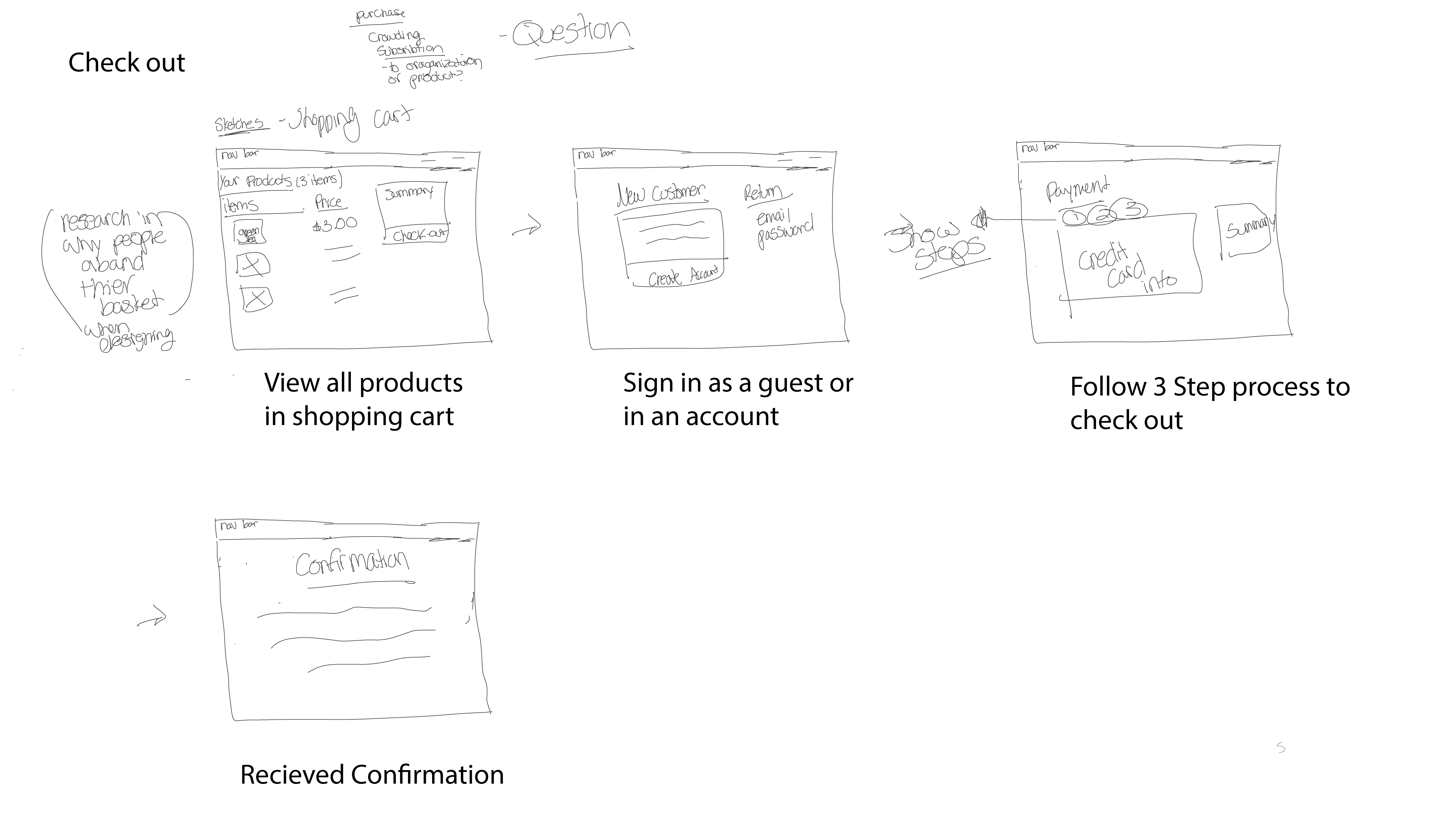
Sketching out Ideas
A design pattern was used to sketch low wireframes and annotate them, which helped me create and receive feedback from my team. In addition, it included a design flow for checkout, changing orders, and the subscription box. Keeping the design system and my research in mind made it easier for me to have the e-commerce page with 3 to 4 steps, a guest checkout area, and the price throughout the process.
The Pivot
Recieving Feedback from the Engineers, Leads and UX Team
With feedback from my team and engineers, we decided to change our overall design and check out processes. Instead of coding it by hand and using Shopify, we decided to purchase a WordPress theme and customize it. The reason was we wanted to save time and have it stand out from our competition.
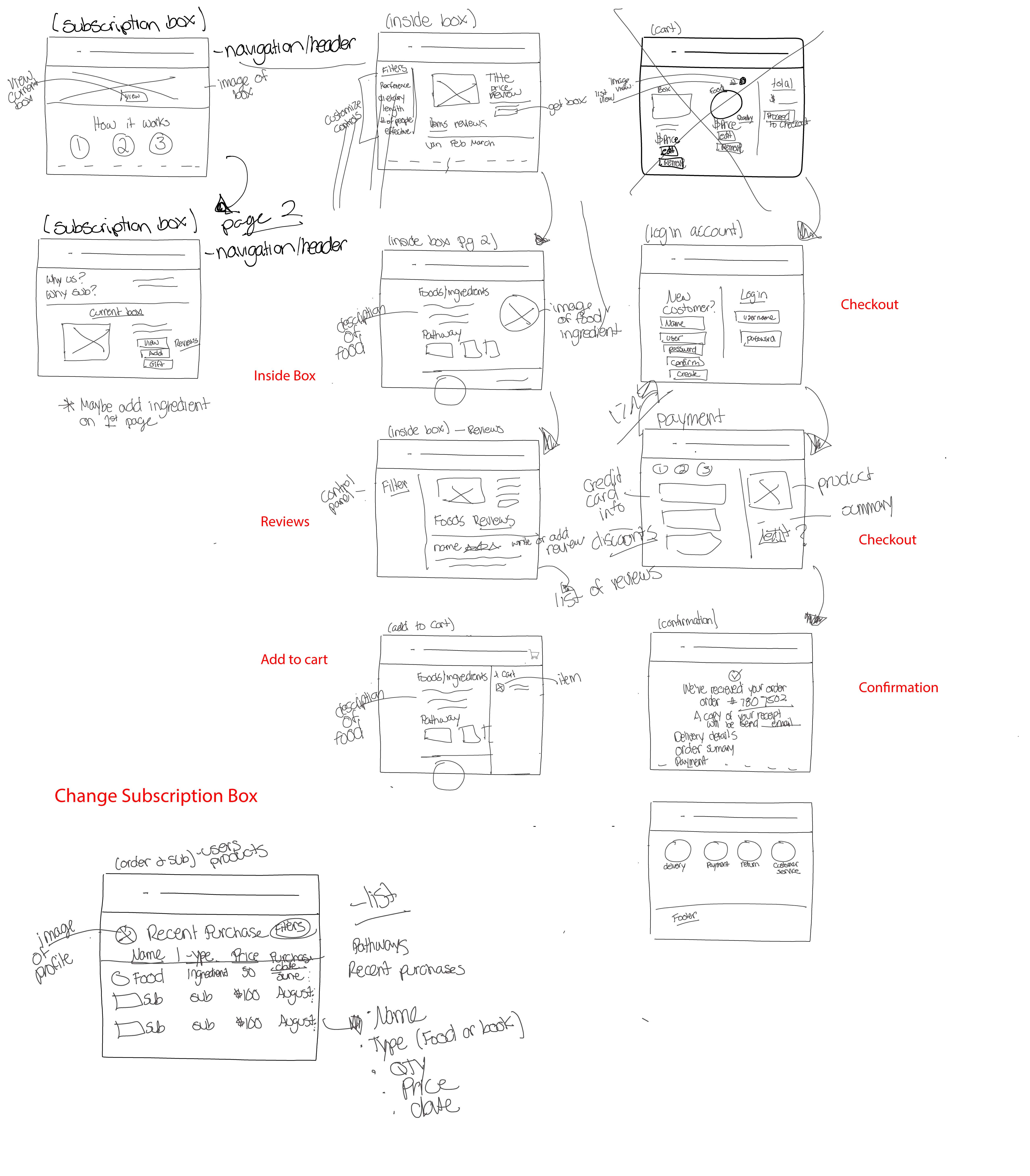
Low Wireframes Part 2
Sketching out New Ideas
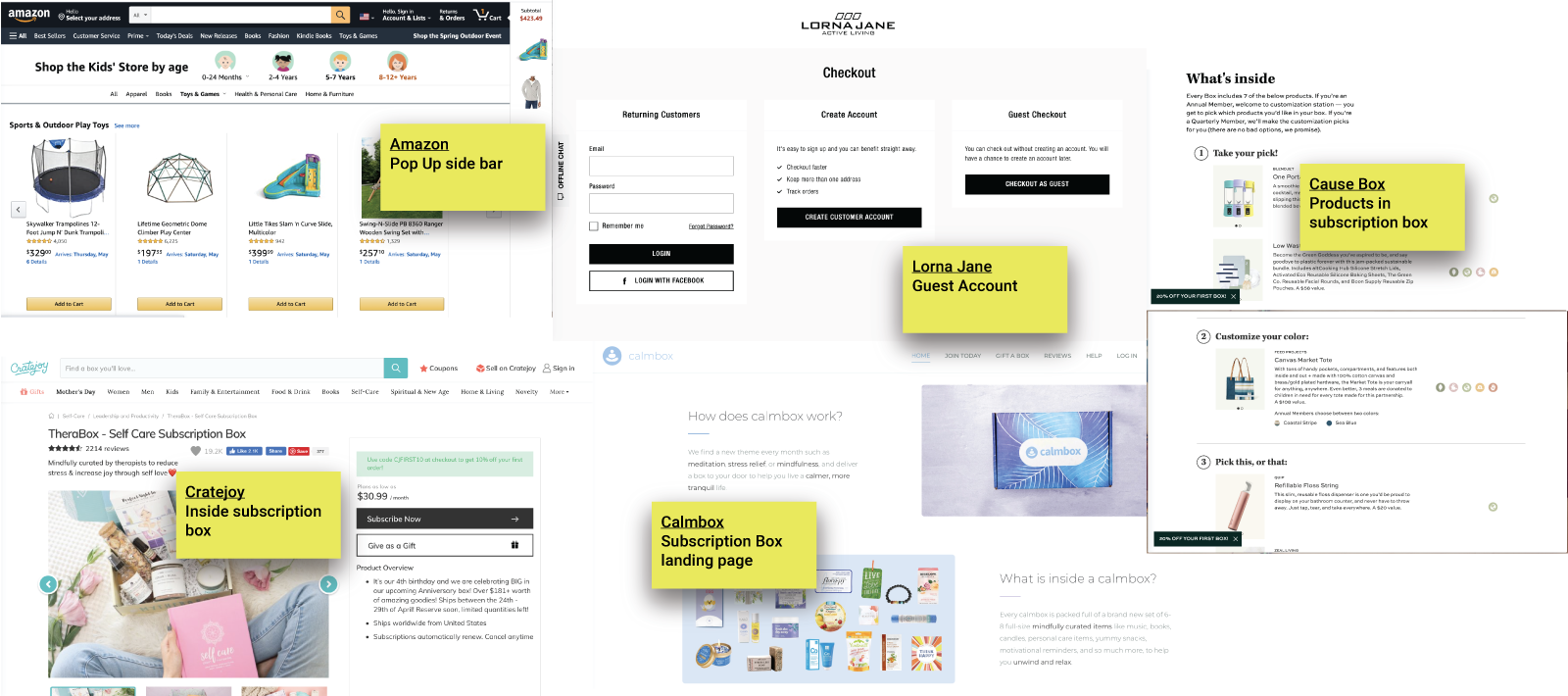
With the feedback from the engineers and the owner, we pivot to make the website more modern and easier to build by using a WordPress template. We did this by looking at many examples of features for inspiration like Amazon, Netflix, Hello Fresh, Shopify, and many more. Then, through screenshots and sticky notes, I wrote the features that connected my eye to discuss with my team.
Once I discuss with my team, I began ideating and sketching my designs on my iPad using an app called concept for feedback.
Prototype
Apply Our Style Guide to Medicinal Foods
Next, I mapped out interaction with the website in Figma so that we could conduct usability testing. This was to identify the MVP and receive engineers' feedback.


Validate
What are our users thinking?
We sent out a survey through different social media platforms and emails with multiple tasks for our potential users to complete and rate. As a result, our participants had both positive and negative responses. The goal was to conduct 21 unmoderated online interviews to gain feedback and insights from our customers.
Task
- Sign-up one the website
- Find foods for stress and learn about Lavender
- Food foods by symptom
- Learn more about Medicinal Foods
- Read about Nervines Pathway
- Find & Subscribe to small monthly box
- Go to you account, manage subscription and change to medium box
“The homepage is easy to understand & follow.”
Result
- 1/5 stated the tasks were difficult to follow
- 20 users completed all task
“I couldn’t find the option of my account.”
-
Understanding E-commerce with more time. With more time, I would have reached out to 5 participants from our 1st round to see if they were interested, conducted 1:1 interviews, and looked at qualitative data to understand what consumers are looking for in an e-commerce site.
-
Many participants were satisfied with the overall experience. With the data we collected from our unmoderated test results, participants understood the application and would use the product once it launched.
-
Not enough time. As a designer and working a full-time job, I would like to have more time to refine my wireframes, attend more meetings, and help out more on the project's scope. This experience taught me to focus on highlight areas and volunteer as much as possible. If I had more time.
-
Understanding E-commerce with more time. With more time, I would have reached out to 5 participants from our 1st round to see if they were interested, conducted 1:1 interviews, and looked at qualitative data to understand what consumers are looking for in an e-commerce site.
-
Moved on to new opportunities. Even though I left the project to move on to new opportunities, I would like to conduct moderated testing for the 2nd round of user testing. This way, I can observe behaviors and ask follow-up questions on why they completed a task a certain way. Overall, I am unsure what changed or happened to the project once I moved on.
What were we planning on doing next?
Would have continued refining and improving the product for our next cycle. We were planning on finishing up our 1st round of user testing. Our goals were to continue refining the product from people experiencing a healthy lifestyle to those suffering from anxiety and stress.
Responsive web flow. Once we completed our refinements, we wanted our application to be responsive. The goal is for anyone can access mobile or tablet devices.
View More Work
IOS Tablet
Touring Art Galleries using AR and VR
Mobile application using AR and VR to enhance visitor experience, providing info, audio, and favorites in real time.
Client: Medicinal Foods
See Case Study